

Can 12 Event Styling Mistakes Be Fixed To Save Your Wedding Beauty?
Your wedding vision feels crystal clear until it meets real budgets and real-world timelines. Avoiding common event styling mistakes is the best way to turn potential planning errors into picture-perfect moments. From ignoring a venue’s character to over-complicating color palettes, understanding these pitfalls allows you to balance beauty with flow for an effortless celebration.
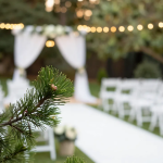
Ignoring the Venue’s Existing Character
Every venue carries its own soul. Stone walls, beach views, or Art Deco columns set a mood before a single flower arrives. Fighting that character costs money and dilutes impact.
Picture a rustic barn draped in icy silver and chrome. The contrast feels forced. Guests sense the disconnect even if they can’t name it.
Styling advice:
• Audit the space first. Walk, take photos, and list colors, textures, and focal points.
• Build your palette to echo, not erase, those features. Weathered wood loves warm metals. Marble floors glow under soft peaches and creams.
Forgetting Function for the Sake of Form
A lounge that blocks the buffet line might look chic in photos but feels chaotic in reality. When flow breaks down, guests stand, wait, and shuffle. My mood drops fast.
Use seating charts, tape, or even string on the floor during setup to test circulation. Can two guests pass each other without bumping elbows? If not, revise. Good looks matter. Yet comfort keeps energy high.
Over-Complicating the Color Palette
More than three dominant hues often equals visual noise. Your photographer spends hours fixing tones, and you pay extra for linens you never notice.
Start with one hero shade, one support, and one grounding neutral. Then sprinkle a single accent on menus or drink garnishes. This tight scheme calms the eye and unifies every shot.
Greige linens or dove-gray candles bridge bold shades. They also photograph beautifully under any light.
Underestimating the Power of Lighting
Most décor mistakes hide in plain sight because rooms are too dim or too bright. Florals flatten. Skin tones skew pink or green. All from bulb choice. Warm amber uplights bring depth to ballrooms and flatter complexions. Cool fairy strings suit open-air coastal decks.
Create a dimmer roadmap: bright for dinner, softer for speeches, moody for dancing. Share it with the venue crew. Five minutes of planning saves fifty editing hours later.
Copy-Pasting Pinterest Without Personalization
Trends ebb fast. What dazzles today can date your album next year. A cookie-cutter setup also feels disconnected from who you are.
Instead, use inspiration as a springboard. Layer your own story on top:
• A family tartan reworked as table runner.
• Hometown wildflowers mixed into centerpieces.
Personal details age well because they stay true.
Neglecting a Cohesive Paper Suite
Stationery is the first styling touch guests see and the last they usually toss. Mismatched stocks, fonts, or ink colors fragment your narrative.
Pick two fonts: one decorative for headings, one clean for body text. If you print invites on cotton, keep that weight for menus and place cards. Cohesion signals care. Colored envelopes or wax seals in your accent shade extend the palette and turn checking the mail into a mini event.
Skimping on Professional Setup Time
Florists, rental teams, and lighting techs need buffer hours. Cut that window and corners get sliced: crooked arches, wrinkled linens, stressed vendors, and a frantic you.
Build teardown fees and overtime into contracts early. A calm crew produces cleaner work and safer installs.
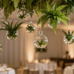
Overlooking the Ceiling and Vertical Space
Guests spend half the evening looking up dancing, chatting, or snapping photos yet ceilings go unstyled in many plans. Empty air feels cavernous.
Suspended florals, draped gauze, or hanging orbs pull eyes upward and cover harsh fixtures. Even a single statement chandelier can shrink a tall hall into an intimate jewel box.
Vertical style also frees floor space for mingling.
Forgetting Sensory Layers Beyond Sight
A wedding is more than a picture. Texture, scent, and sound seal memories in the brain.
Layer linen weights: thick woven runners feel cozy against winter china; sheer chiffon whispers summer breeze. Introduce scent zones eucalyptus at the ceremony, vanilla near dessert to trigger nostalgia later. Match music to materials: a string trio underscores sleek modern décor, while acoustic folk warms rustic wood. Leave no sense behind and guests feel the magic without knowing why.
Failing to Repurpose Ceremony Décor
Florals cost. Yet aisle arrangements often wilt out of sight once vows end. Why pay twice?
Move those pieces. Let them frame the bar, flank the band, or trail along the sweetheart table. Petal cones leftover from the processional can become confetti for the exit. Reusing cuts waste and keeps visual threads intact.
Leaving No Contingency for Weather
Outdoor vows under clear skies are dreamy until wind flings programs or rain spots wooden chairs. Lacking a Plan B sits at the top of wedding planning errors.
Reserve umbrellas matching your palette. Choose tent liners that hide metal poles. Anchor signage so guests can’t send boards flying. Guests stay dry, calm, and grateful.
Not Communicating Style Decisions to All Vendors
Your florist lives in color codes, but your DJ runs on playlists. Without cross-vendor sync, the room feels piecemeal.
Draft a one-page style manifesto. List palette swatches, lighting notes, and key adjectives moody, airy, refined. Schedule quick 15-minute check-ins monthly. Everyone stays aligned, and event styling mistakes vanish before they start.
Conclusion: Turn Pitfalls into Picture-Perfect Moments
Wedding style thrives on details, yet those details need a plan. Respect the venue’s soul. Balance beauty with flow. Let light guide color. Personalize trends. Sync every vendor. When senses align, décor mistakes fade and guests remember the feeling, easy, warm, and perfectly you.
Follow this styling advice, and your day will look effortless, feel personal, and shine in every photo.
FAQs
1. What is the quickest way to spot event styling mistakes before the wedding?
Hold a full mock-table setup under venue lighting a month out; misfit colors and décor mistakes jump out instantly and remain easy to fix.
2. How many colors should appear in a cohesive wedding palette?
Three core shades, one dominant, one secondary, one neutral, plus one small accent keep designs balanced, avoid wedding planning errors, and simplify rental orders.
3. Why does lighting cause so many wedding décor mistakes?
Bulb warmth shifts flower and fabric tones; ignoring this leads to dull photos and uneven skin color, underscoring why styling advice always includes lighting tests.
4. Can I reuse ceremony flowers without harming the look?
Yes. Move aisle pieces to the reception; guests see seamless décor, budgets stretch further, and sustainability rises, eliminating common event styling mistakes.
5. Do I need professional setup if my décor feels simple?
Even minimal designs demand precision. Pros secure installs fast, protect venues, and prevent last-minute chaos that spawns costly wedding planning errors.